Competitor Analysis (version 1)
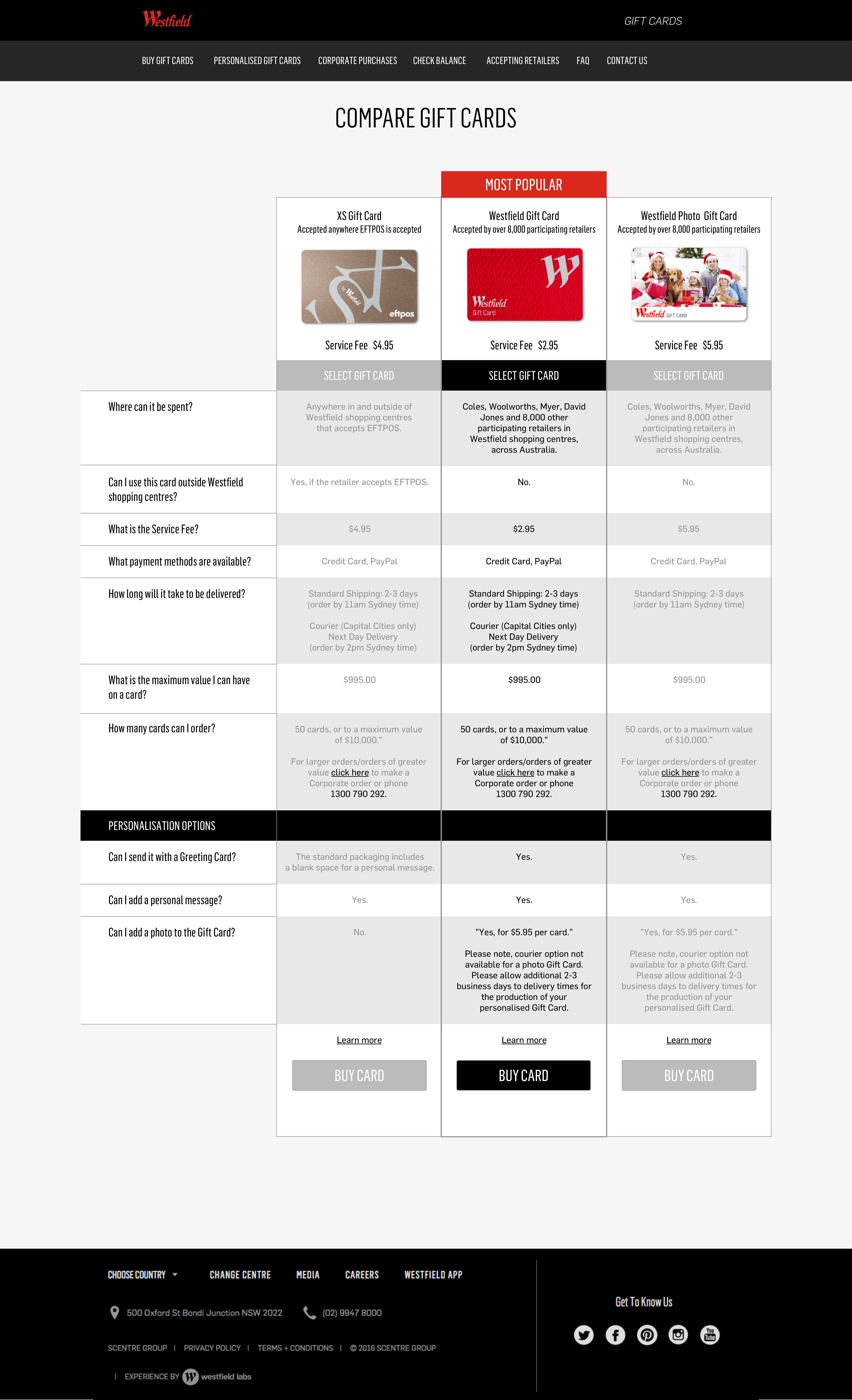
Conducting competitor analysis research showed that most websites use very detailed comparison tables. I was asked to try using this methodology and come up with a desktop design.
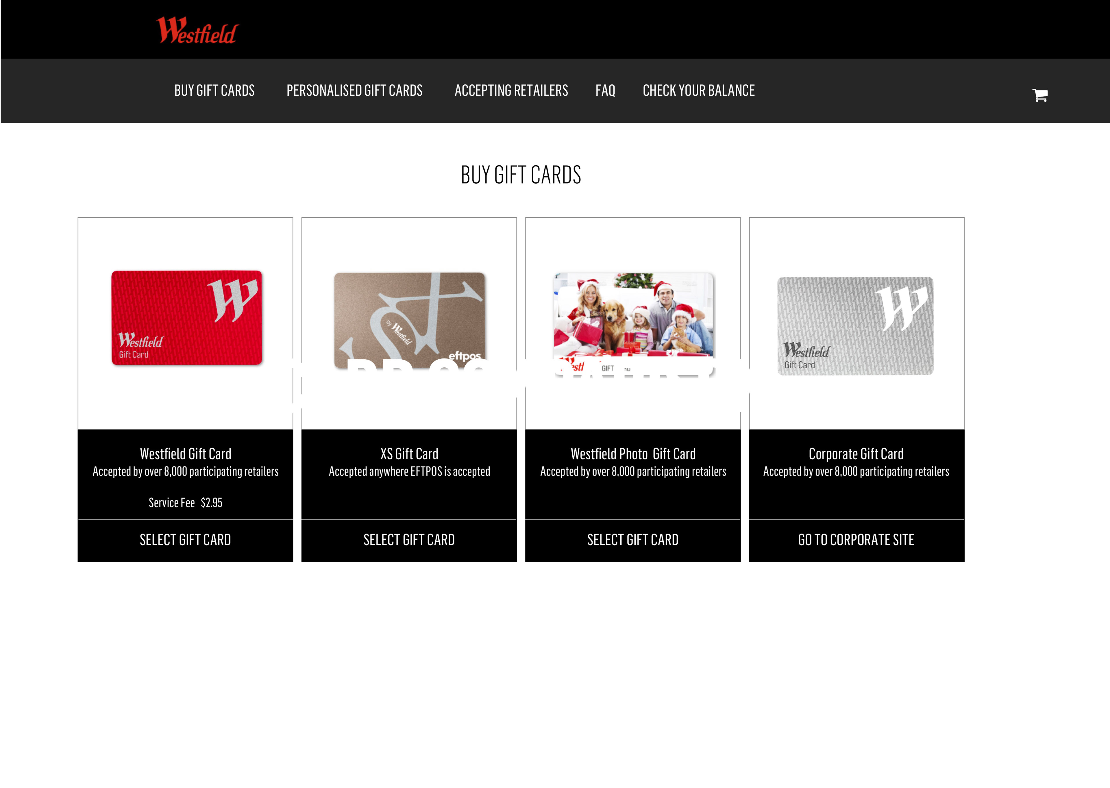
After doing some wireframing, I came up with the below screens (version 1). The only difference between the below screens are the quantity of options, internal testing found that there were too many options, and therefore too many clicks, for users to purchase a gift card.

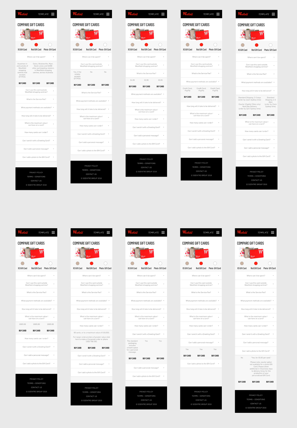
Mobile Version 1
Using the desktop screens, I designed a mobile details version. Wanting the screens to be less cluttered, I used the accordion navigation to show and hide information so users did not have to scroll too much.
Feedback of Version 1
The above versions were well received in it's detail, but after conducting some internal user testing, it became clear that there was too much information and no stimulating iconography. Users were forced to read through all the text as opposed to easily finding the information they were after.
Creating Version 2
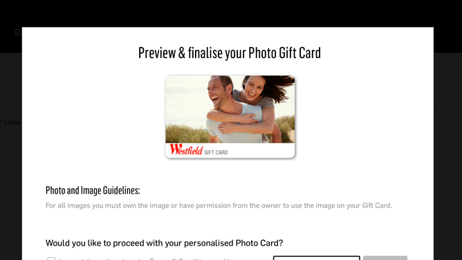
Using this feedback and a design workshop with the UX/UI team, I put forth the idea that I would create my own copy (which was approved) to reduce the amount of text and content that would clutter the design.
During this time, I attended an IxDA event where Commonwealth Bank Executive Experience Manager Larissa Acevedo spoke about creating friendly application forms. This struck a cord with me and I used this methodology when creating the below screens (version 2).
I also wanted to make the design responsive, this way the layout would not have to change when users went to a mobile device.
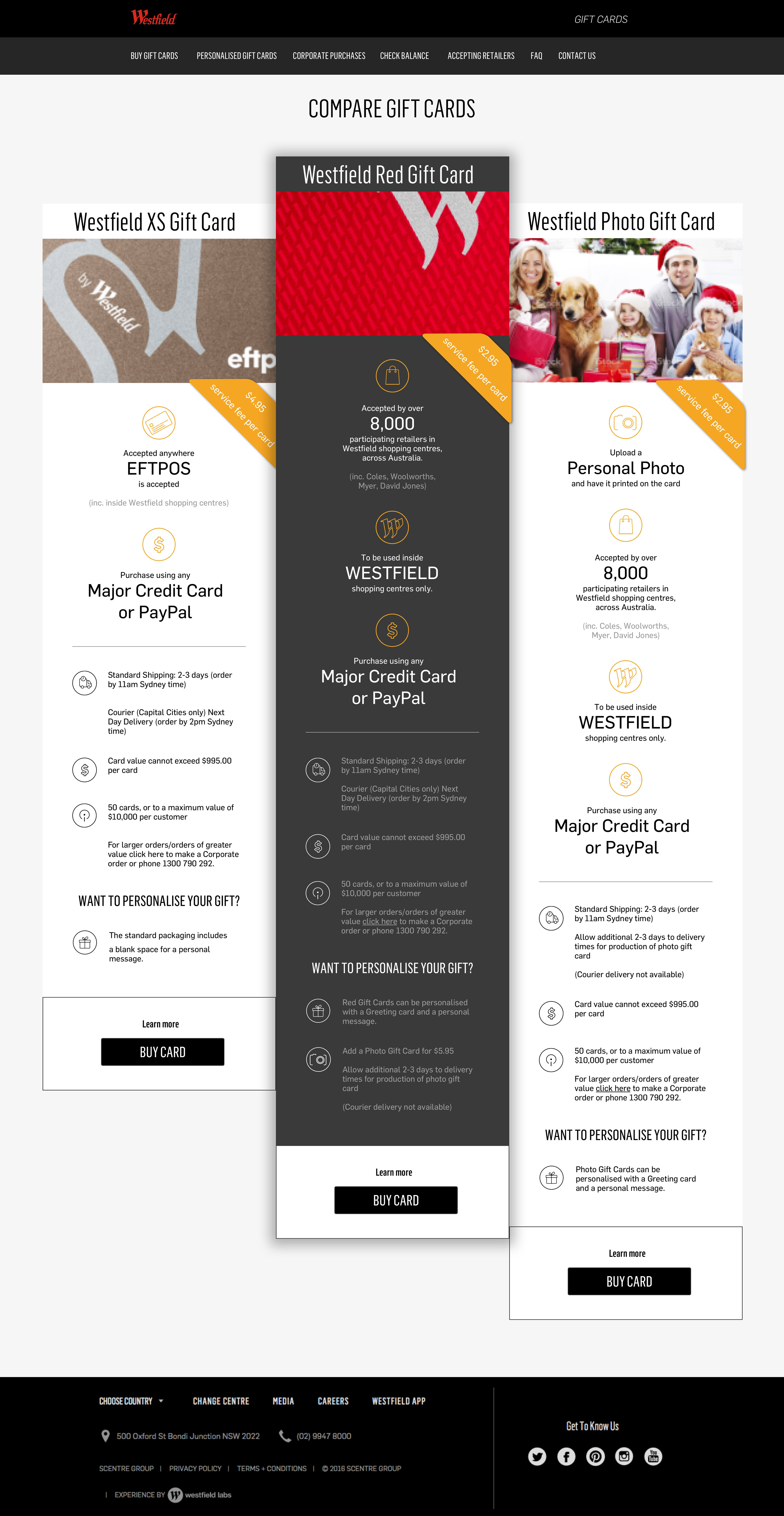
Feedback of version 2
This design was approved by the rest of the team and I was given the go-ahead to create the mobile version. User testing showed that customers were able to locate the information they were after easily and liked that the most important information was the focus.
Mobile version 2
Using above design, I created the below so that the users can scroll left or right between card types. Also, the top sticky global navigation allows users to tap on the card they want to view even if they've scrolled down the page.

Using Sketch
I created the below quick video to show my use to the Sketch app to tinker with my design.