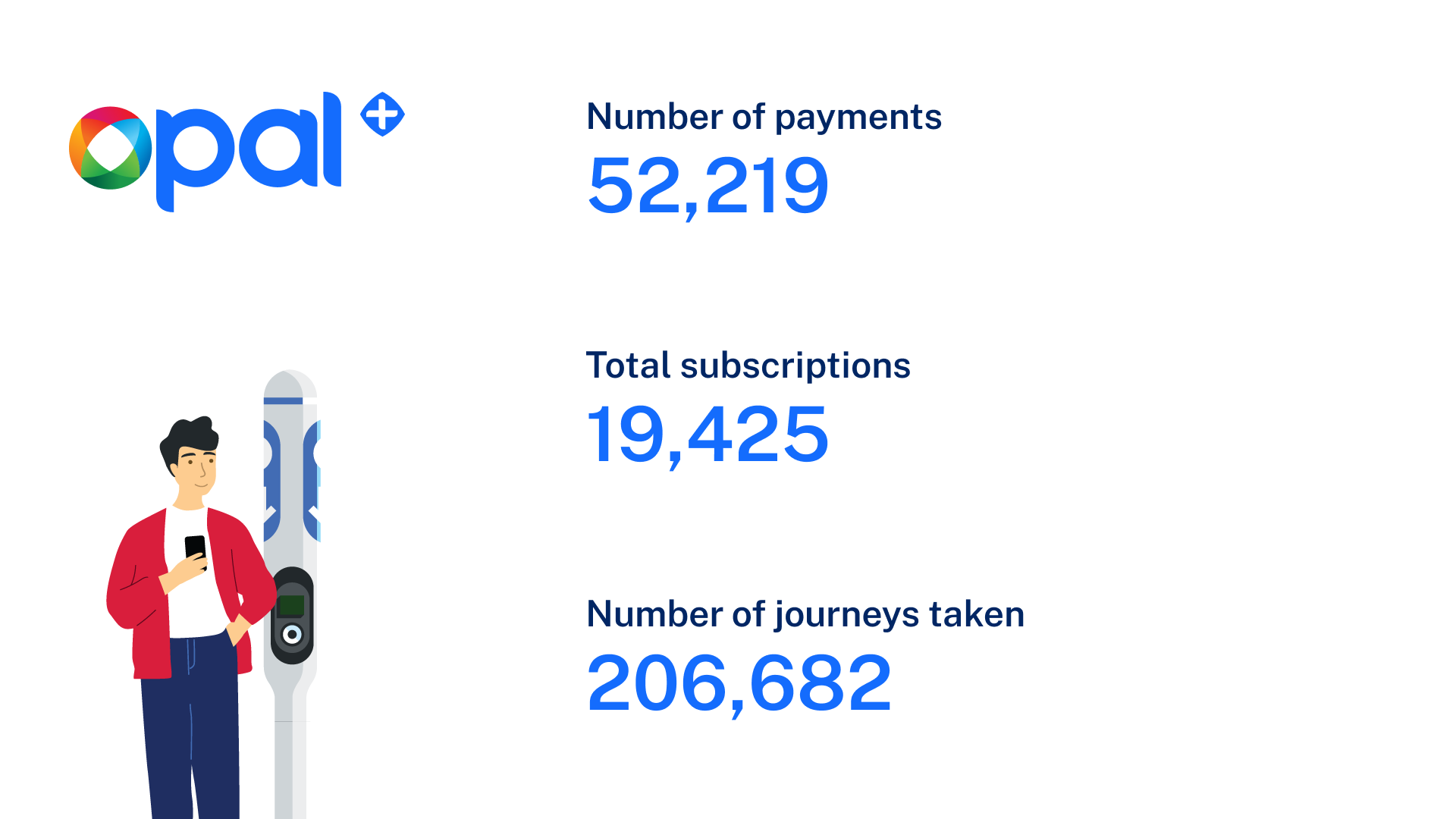

Problem
Facilitate a transition away from personally-owned modes of transportation towards Mobility as a Service (MaaS). A key objective was to assess customer acceptance of subscription-based packages. To achieve this, a trial was conducted over a 12-month period, involving up 10,000 participants.
The trial placed a specific emphasis on encouraging off-peak public transport and active transport usage. Participants were invited to join the trial through an email campaign, and full participation was required to access the app's features. This approach ensured that users actively engaged with the app and provided valuable feedback.
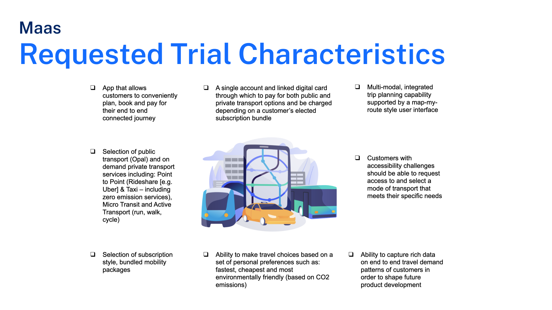
Within the project, the product team defined specific trial characteristics.
My role and responsibilities
My role was that of a versatile "T-shaped" UX/UI designer. This approach allowed me to contribute to various aspects to the project. The overarching goal set by the business was to create a user-friendly platform that enabled customers to seamlessly plan, book, and pay for end-to-end journeys using subscription-style bundled mobility packages without the need for multiple apps.
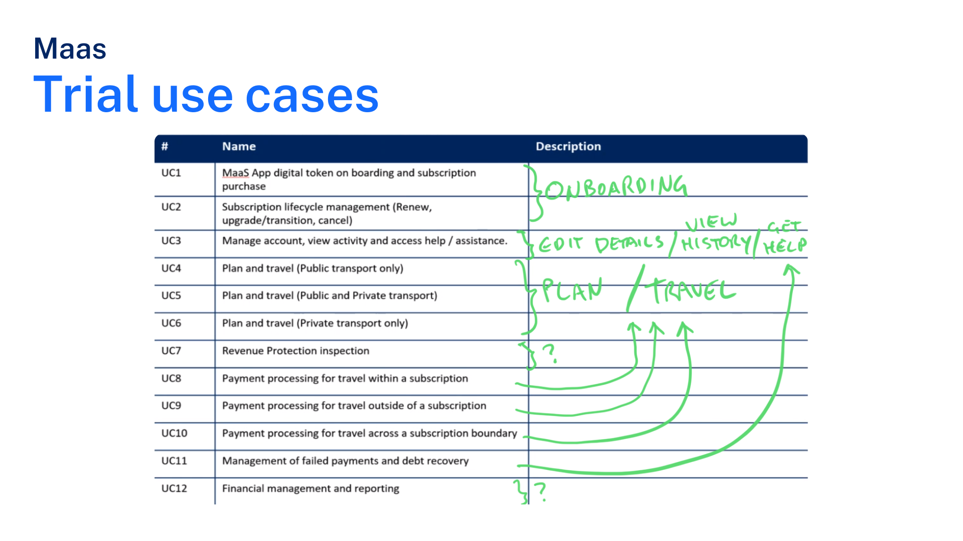
To efficiently handle the complexity of the project, we focused on 4 specific use cases of app, focused around the subscription and add-on features, with the goal of ensuring that users could easily understand, select, and manage their subscription plans while also customising their experience with relevant add-ons. This allowed us to work effectively, streamline our design efforts, and deliver a comprehensive solution within the project's timeframe.
Use cases
These are the 4 use cases, focused on:
Digital Token Onboarding and Subscription Purchase: Simplifying the process of onboarding users by introducing digital tokens and enabling them to purchase subscriptions.
Plan and Travel (Public Transport Only): Streamlining the journey planning and booking process for public transport.
Plan and Travel (Public and Private Transport): Extending the app's functionality to include both public and private transport options for users seeking integrated travel solutions.
Plan and Travel (Private Transport Only): Catering to users who prefer private transportation modes, allowing them to plan and book their journeys efficiently.
My Process
My initial steps involved research and analysis to lay a strong foundation for the project.
Here's an overview of the key activities:
Here's an overview of the key activities:
I began by collating existing personas and user research to ensure we had a deep understanding of our target audiences and allowed us to understand their needs, preferences, pain points, and behaviours.
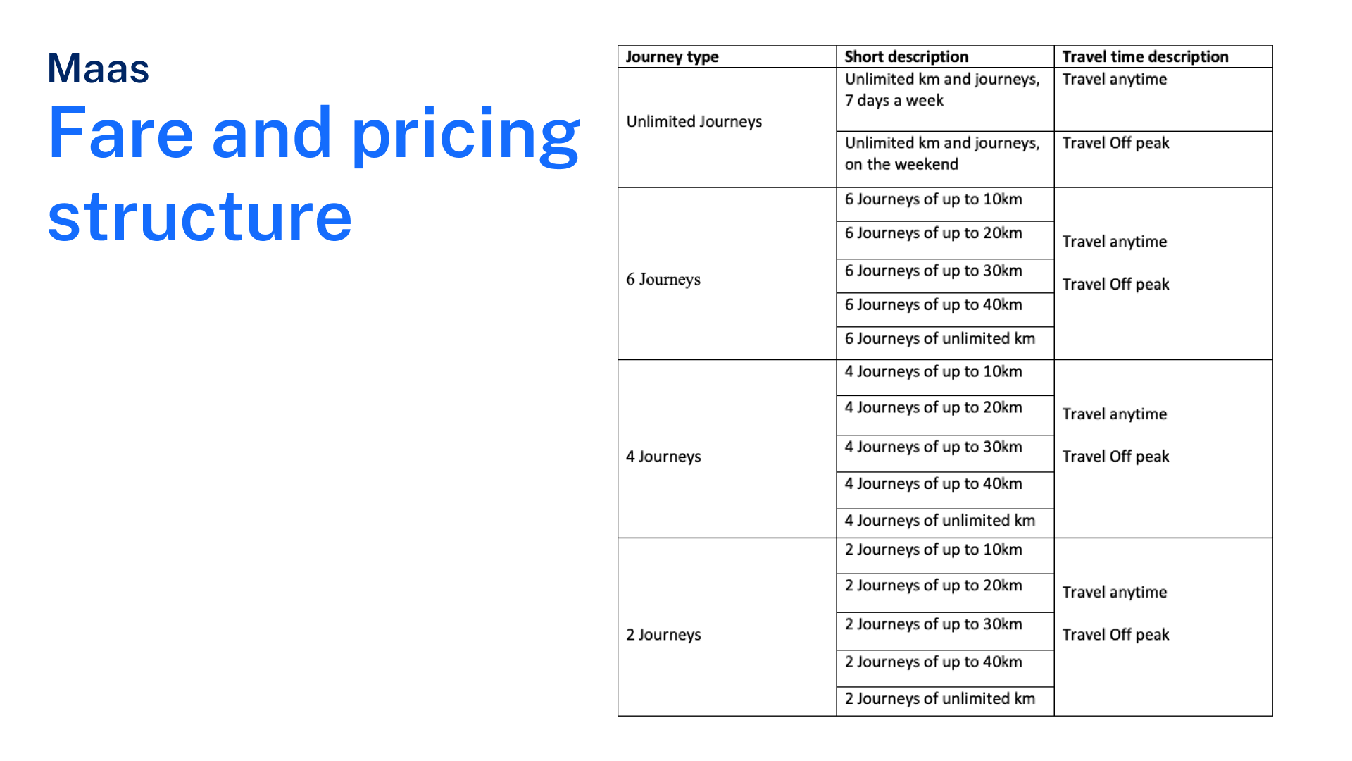
We assessed the current fare information and pricing structure to gain insights into the existing payment ecosystem. Understanding the financial aspects was crucial to designing subscription-based packages effectively.
To stay competitive and informed, we conducted a thorough analysis of existing transport-related products and services in the market. This helped us identify trends, best practices, and areas where we could innovate in the Mobility as a Service (MaaS) landscape.
Customer journey mapping
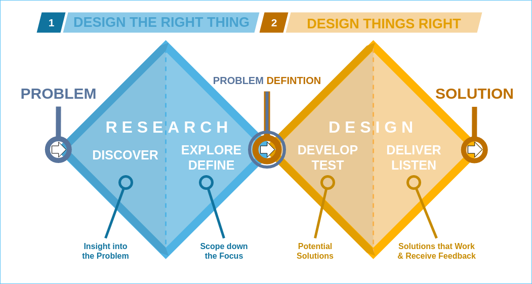
Following design thinking principles, we adopted the Double Diamond approach, which consists of four distinct phases: Discover, Define, Develop, and Deliver. In the initial "Discover" phase, our focus was on understanding the problem space comprehensively.
We leveraged insights from the user research to created detailed customer journey maps. These maps represented the end-to-end user experience, highlighting pain points, touch-points, and opportunities for improvement. By doing so, we gained valuable insights into the needs and pain points of NSW commuters.
The customer journey mapping helped to define the features and actions we would focus on and it validated the use cases from product;
1. explaining journeys,
2. auto renewal of subscriptions,
3. subscription management and cost activities
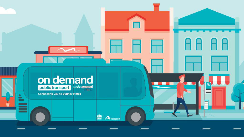
4. OnDemand services

Competitor analysis
We then conducted user-interface (UI) competitive analysis of apps and companies that offered subscription based packages and ended up focusing in on Netflix and some Telcos as they aligned closely to what Transport required.
UI Competitor analysis
UX / Subscription model Competitor analysis
The competitive analysis defined how to present the fare constructs of the subs model and insights on UI patterns.
Next steps informed by workshop
After creating and workshopping several customer journey maps and analysing our competitors, we were able to identify user tasks that were imperative to success of the app:
As a user with a subscription I want to:
As a user with a subscription I want to:
1. Selecting a subscription plan
2. Selecting plan options (KMs and Peak and off peak)
3. Selecting Add-ons
4. Making a payment
5. Modify my number of journeys (“Plan”)
6. Modify my options (possibly peak/off-peak and kms)
7. Modify my add-ons
8. Modify my number of journeys AND options
9. Modify my number of journeys AND add-ons
10. Modify my options AND add-ons
11. Modify my number of journeys AND options AND add-ons
12. Modify my billing method
13. Cancel my subscription
14. View when my new subscription settings will be active
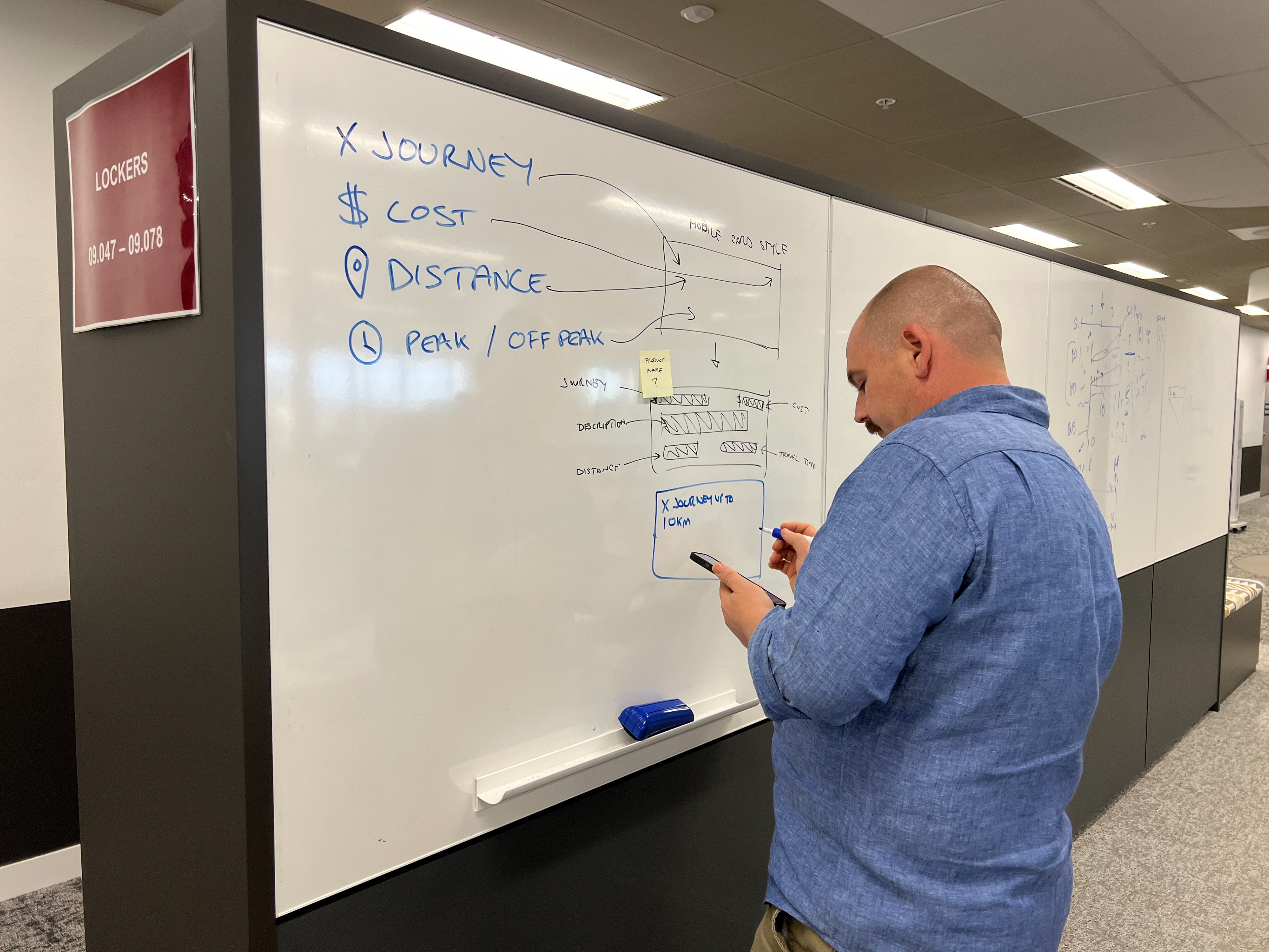
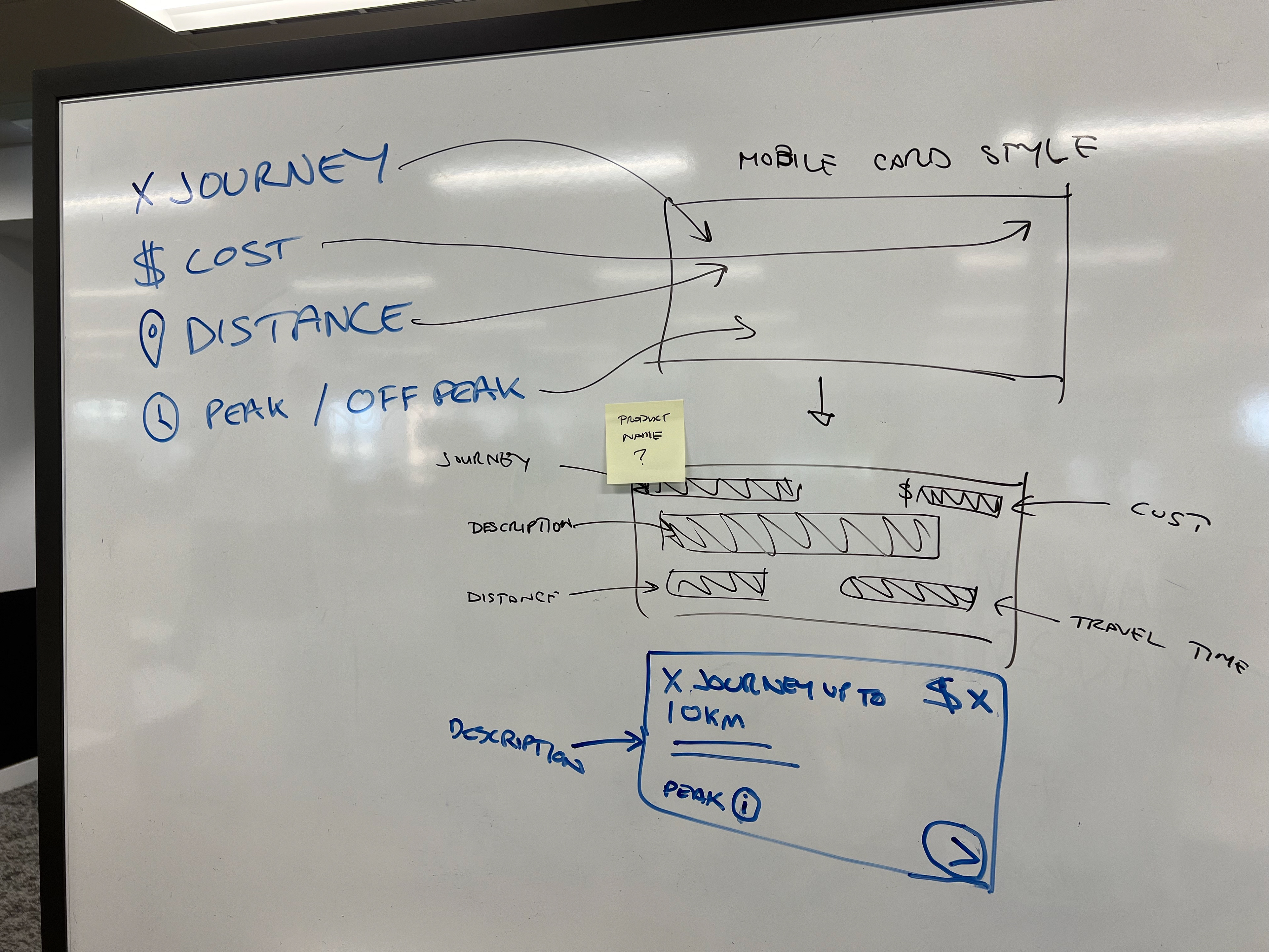
Wireframes
Using Figjam we created some wire concepts from the sample product construct, in collaboration with the Product owner/ mangers and BAs and developers to get their input and buy and from the workshop we voted on the wires we would like to move forward with as a team.

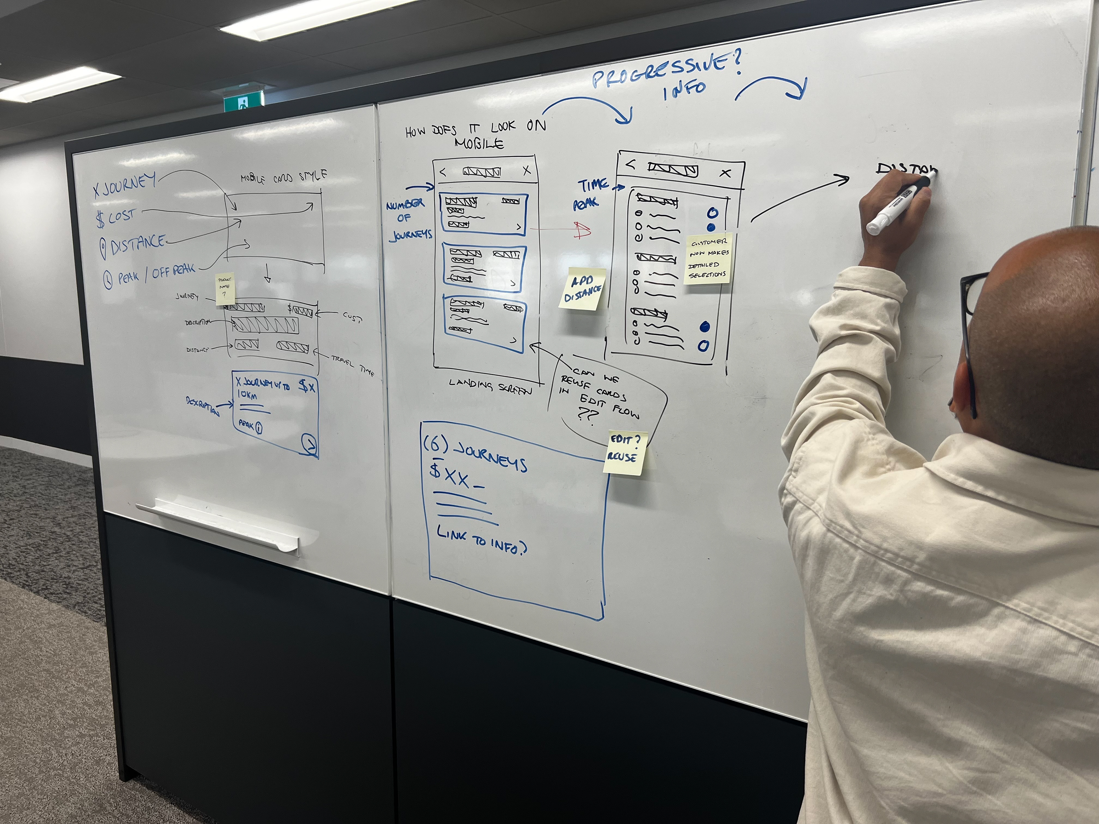
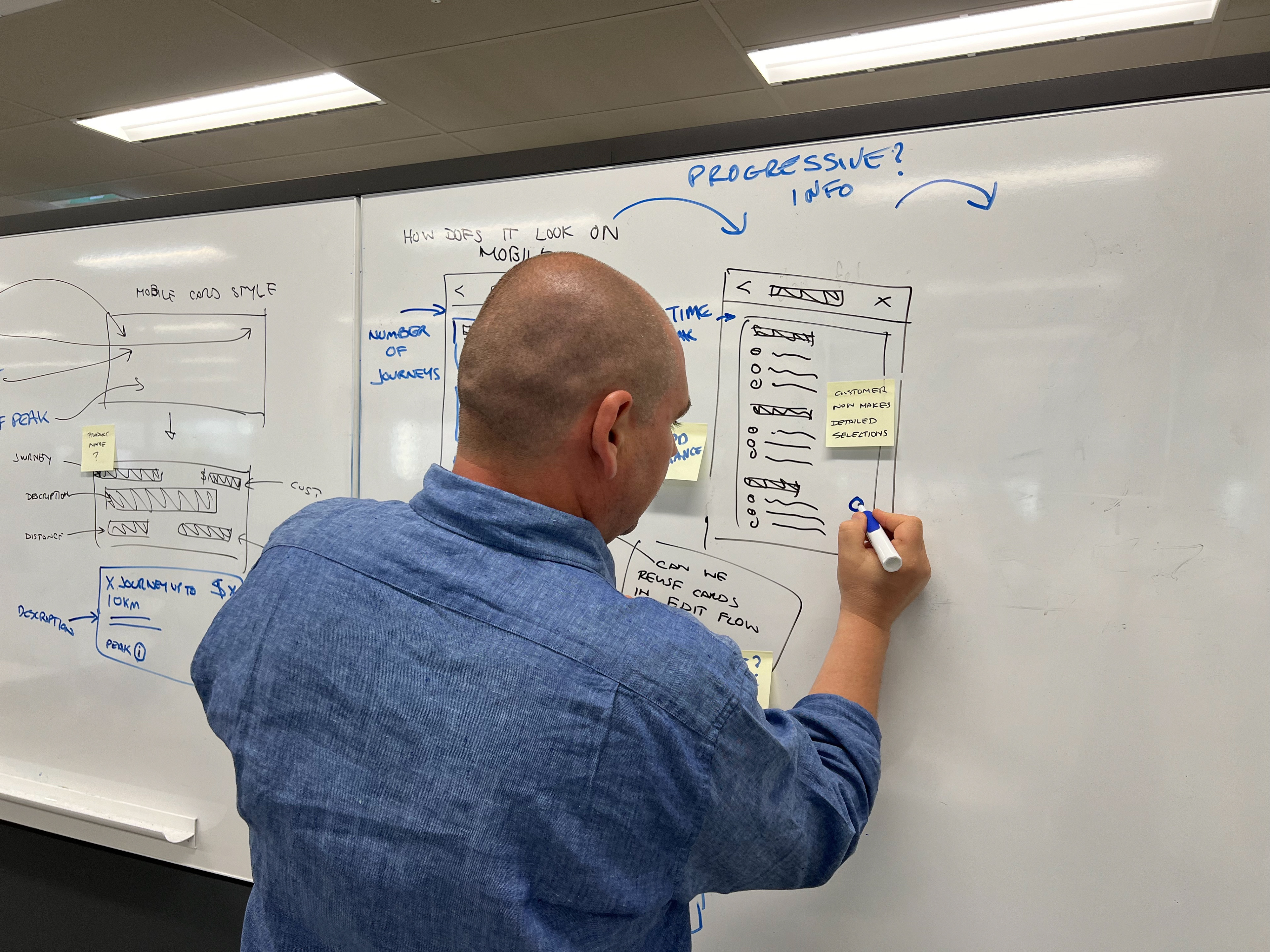
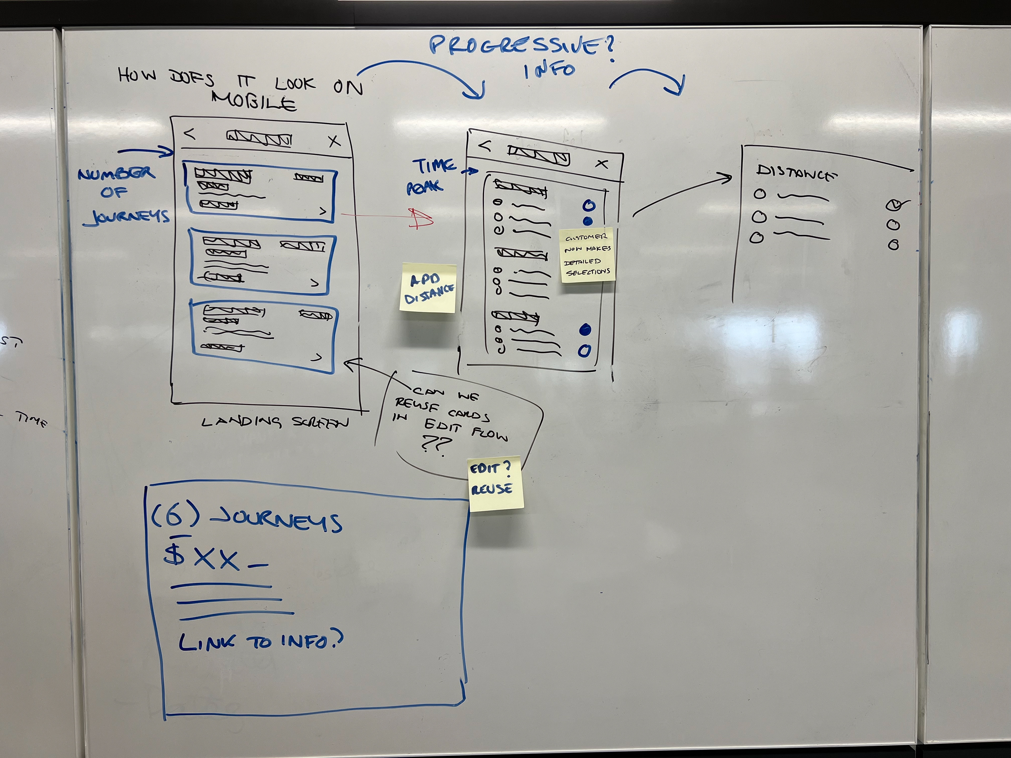
Mobile App patterns
Drawing upon my extensive experience as a Senior UX/UI Designer, I possess a deep appreciation for the nuances of mobile app design patterns. My proficiency extends to navigating the intricacies of design systems, with a particular focus on adhering to Apple's Human Interface Guidelines (HIG) and Google's Material Design.
Apple's HIG and Google's Material Design are both renowned for their comprehensive frameworks, offering insights and components for crafting exceptional user interfaces (UIs) and user experiences (UX). Here's a closer look at how I incorporate the principles of these two design systems into my work:
Visual Style: Within Apple's design ethos, I champion a clean and minimalist aesthetic, whilst adhering to TfNSW’s branding guidelines. My designs prioritise clarity, legibility, and simplicity in UI elements. When adhering to Google's Material Design, I embrace a tactile and three-dimensional approach, all while keeping design consistency across both iOS and Android as specified by our brand guidelines.
Typography: I emphasise the importance of accessible and consistent typography by utilising Apple's iOS and Android’s native fonts.
Icons: Aligning with Apple's preference for simplicity and recognisability, I adhere to a consistent and uniform style that often employs simple grid-based alignment approach. When adopting Material Design, I utilise icons with depth and motion, embracing the distinctive 'material' style.
Layout and Grid System: I implemented auto-layouts, with spacing and breakpoints to craft flexible and adaptive layouts, seamlessly accommodating various device sizes and orientations—a hallmark of Apple's approach. In contrast, Material Design introduces a 'baseline grid' system, which I utilise to maintain consistent vertical rhythm and alignment. While both systems promote responsive design, Google's Material Design offers more specific grid guidelines.
Interaction and Motion: Creating Interactions and Motions within my designs were smooth, natural, and intuitive, utilising native components ensuring users were provided with responsive feedback. This was evident in my use of native components, such as Action Sheets on Apple devices and bottom sheets on Android devices, offering essential information and choices, such as cancellation options within subscription screen flows.
I consistently strive to create user-friendly and aesthetically pleasing interfaces. My comprehensive understanding of both Apple's Human Interface Guidelines and Google's Material Design equips me with the versatility to select and implement the design system best suited to the specific platform and user base while never wavering from TfNSW’s brand guidelines.
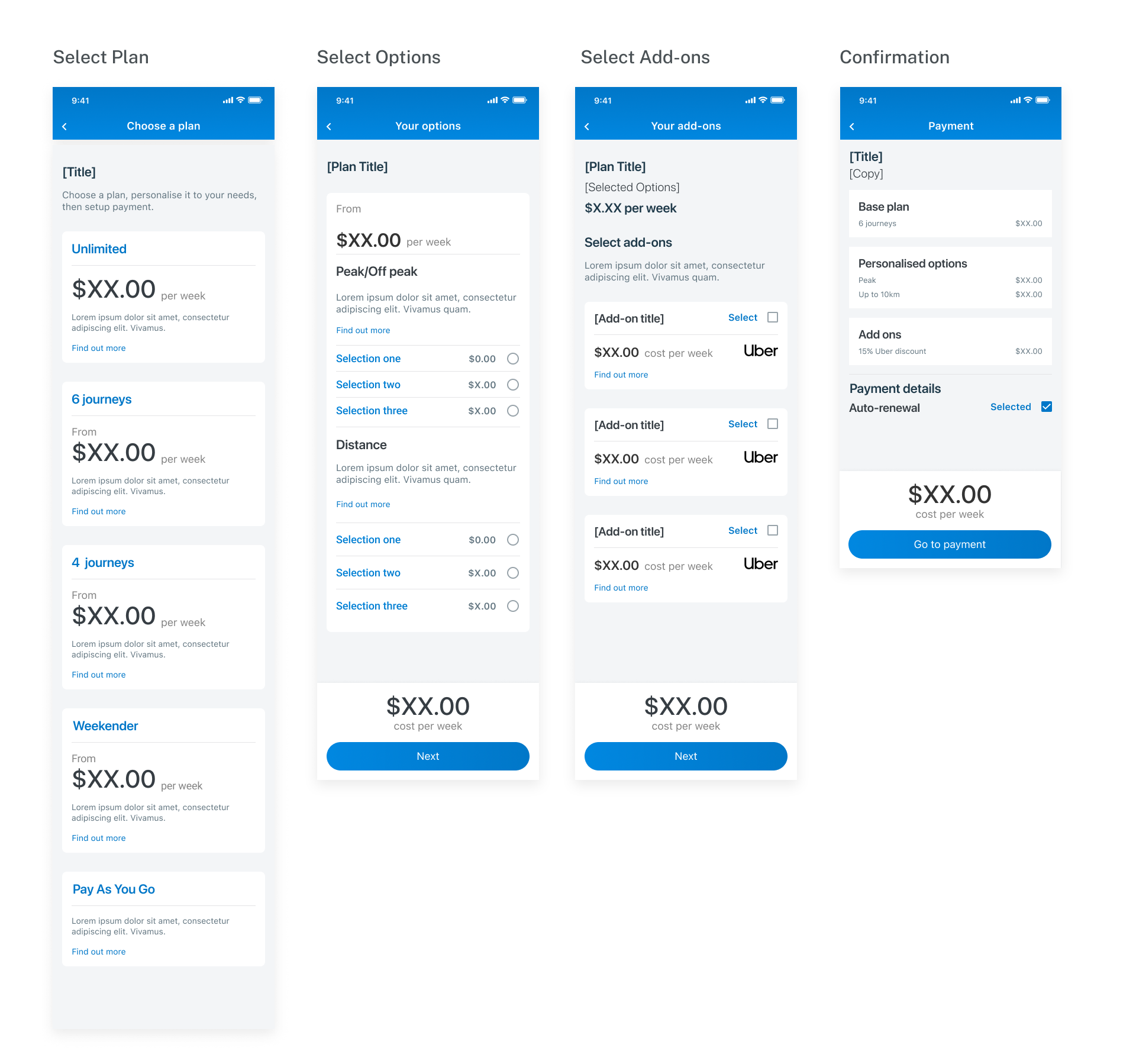
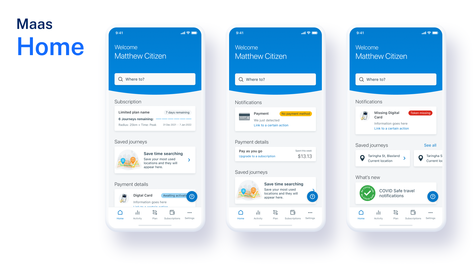
High-fidelity Concepts
Due to the fast moving nature of the project and Transport for NSW’s need to quickly build and deploy the trial app, we created some initial low-fidelity wireframes before quickly shifting our attention to a higher fidelity UI. Utilising existing Opal Travel app styles and components, together with our working knowledge of Apple’s Human Interface Guidelines (HIG) and Android’s Material Design patterns, we were able to rapidly design, build and implement high-fidelity screens.
User-testing
These screens were then used to create prototypes that were very complex in order to user test each of the use-cases outlined in the project brief. Using these designs, we briefed our researcher on our usability testing objectives. Our intension was to uncovering general usability concerns whilst also having key assumptions that we needed to prove/disprove, those being
Objectives
Uncover the following to inform the next design iteration:
1. Identify users perception of subscriptions
2. Friction or painpoints
3. Unmet needs
4. New opportunities to design for
5. General usability issues
Measures of success
1. Task completion
2. Took a subscription, was able to change it
3. Understands the concept of subscription, options and add ons
3. Time taken to complete tasks
Working together with the research we reviewed the findings and discussed potential recommendations.
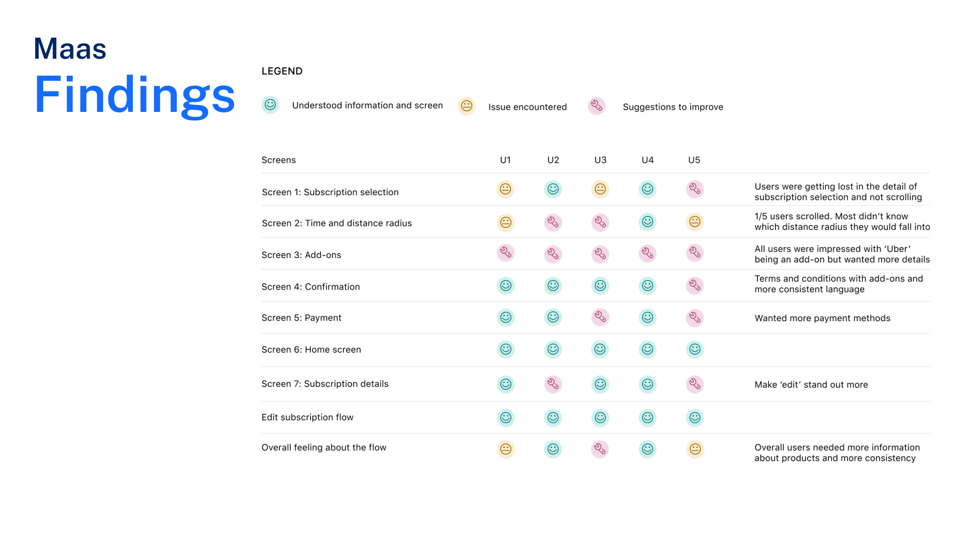
Recommendations
1. Homescreen was easy to understand
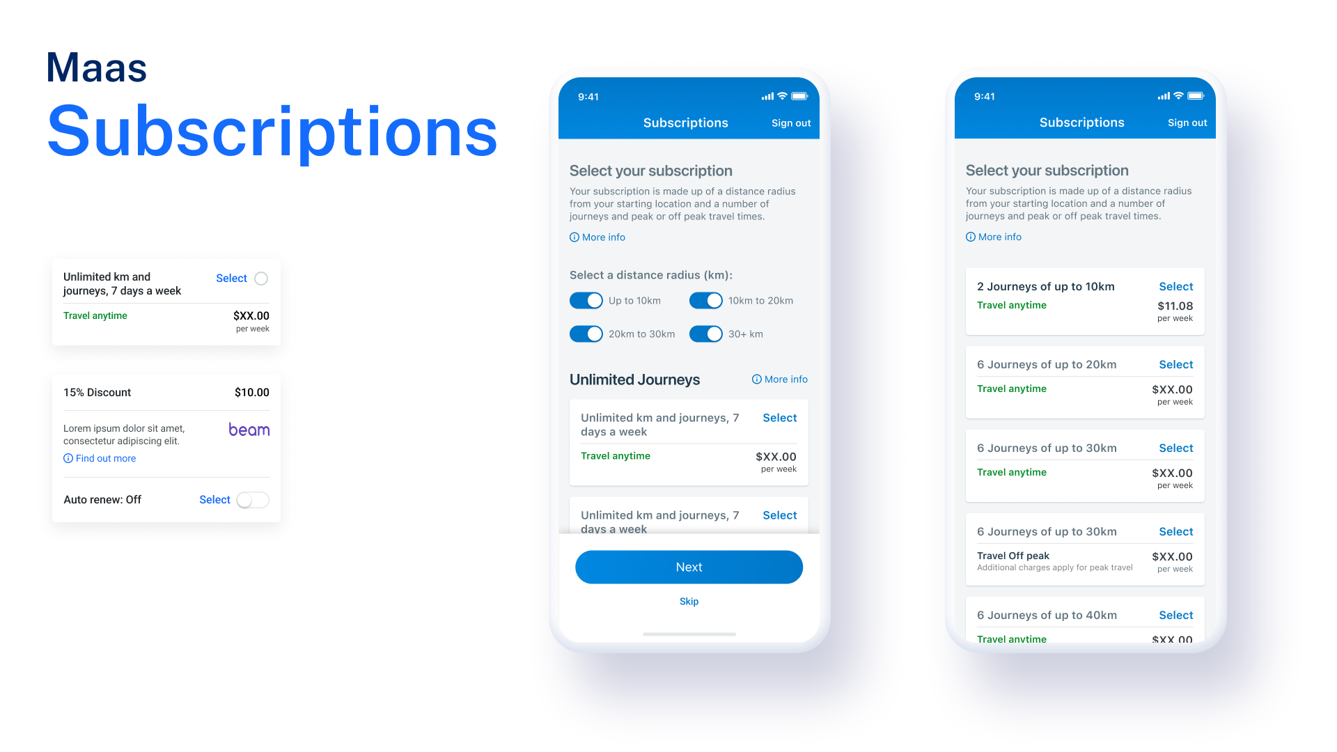
2. Split distance radius and time into seperate screens
3. Adjust language such as ‘peak’ to ‘all times’
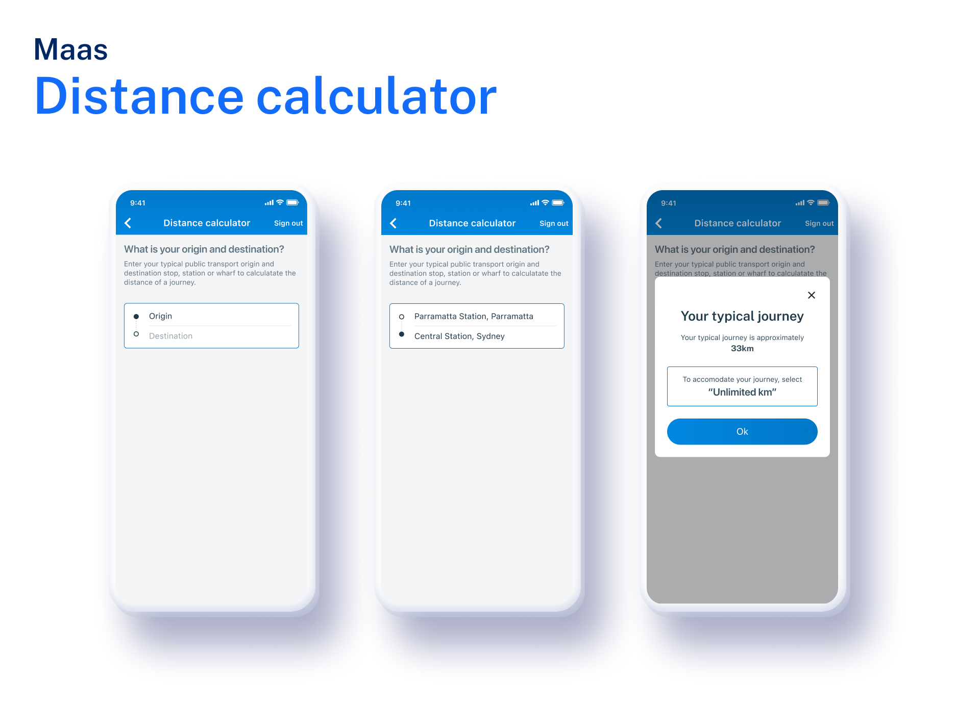
4. Add an internal tool to help users calculate their specific distance
5. Make components consistent with one another
6. Expand description for each add on and links for further explanation so users are clear on what they will get for each
7. Consistent language
8. Make the ‘edit’ buttons more prominent
9. To improve information hierarchy, combine subscription details (at top of screen) with the price sticky at the bottom of the screen
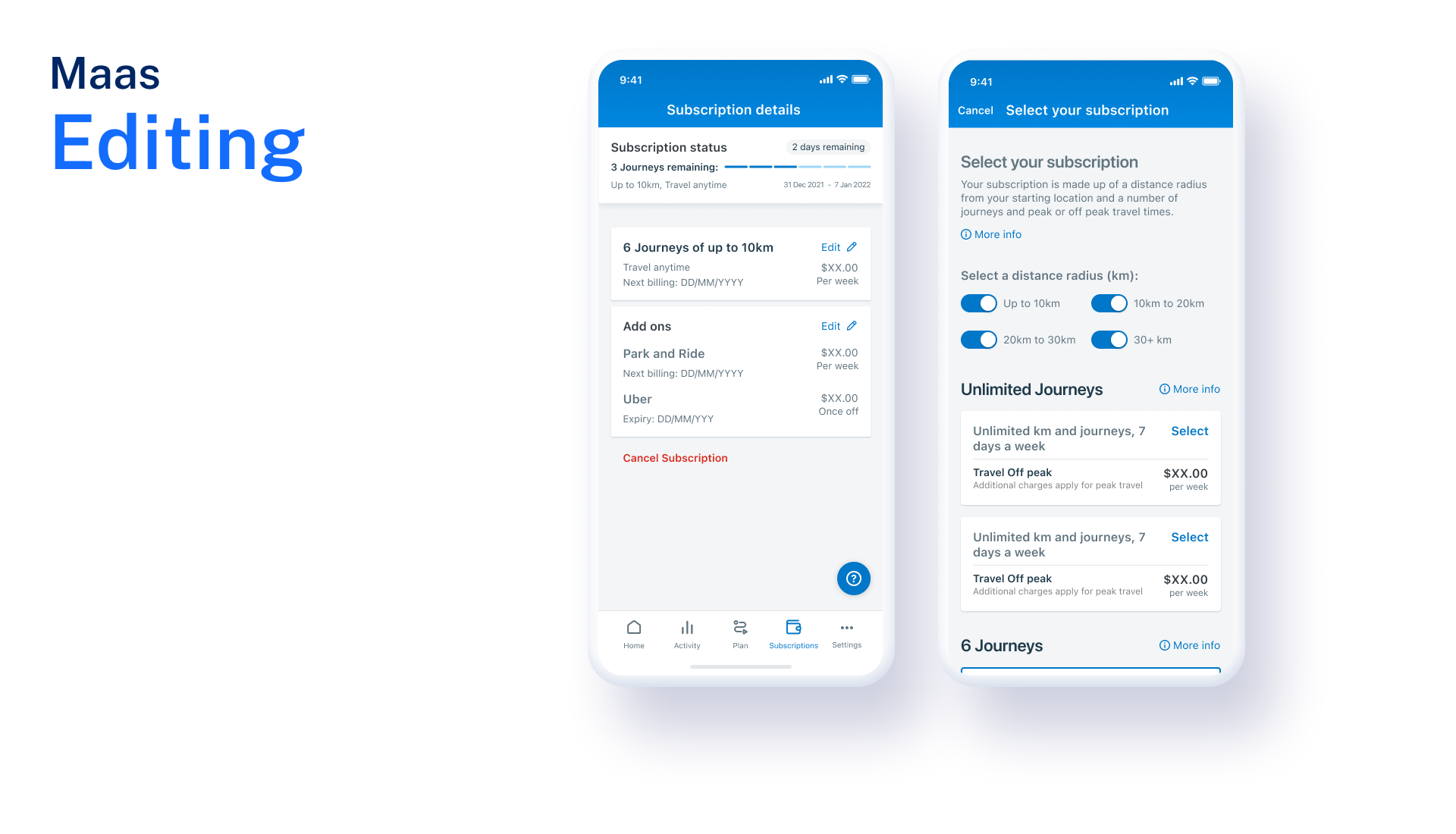
Improvements / iterations
Based on the user testing results we made iterations to improve the information hierarchy and the usability, we split out the distances and provided a calculator and created links to explain other concepts like journeys and peak and off peak.
Worked closely with developers, BAs & delivery manager to ensure smooth, phased delivery of the screens.
Conclusion
"In conclusion, our Mobility as a Service (MaaS) trial app not only proved to be a successful framework but also served as a testament to the power of user-centric design and innovation. The app's user experience (UX) and user interface (UI) laid a strong foundation that can be readily harnessed for future market deployment with adjusted pricing strategies.
Throughout the trial, we embarked on a profound learning journey. The trial illuminated critical insights into user behaviour, shedding light on the evolving needs of our customers. It became evident that to truly align with user travel behaviour, Transport for NSW (TfNSW) needed to reevaluate and recalibrate our pricing and subscription offerings.
Our journey through this trial has positioned us at the forefront of reimagining urban mobility. Armed with a successful app framework and a deeper understanding of customer preferences, we are primed to shape the future of transportation, where pricing and subscriptions seamlessly match the dynamic rhythms of user travel behaviour. This journey is far from over—it's an invitation to continue innovating and evolving, all in pursuit of a more connected and convenient transportation ecosystem."