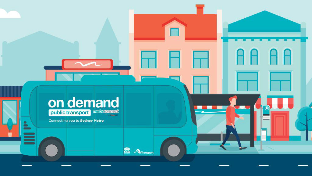
Project overview
My role: Lead UX/UI Designer / Project Lead
My process: Constraints on time meant I needed to streamline how many iterations were made during this phase
1. Identify the goals of this phase
2. Create wireframes with existing user-flow
3. Create high-fidelity user-interfaces including developer notes
4. Build prototype
5. Prepare for user-testing
The team: Product Owner, 2 BA's, 2 developers (iOS and Android), Tech Lead and various other stakeholders
Discovery recap
Initial discovery
During the initial discovery phase, we utilised extensive data and stakeholder interviews to comprehend the unique needs and preferences of existing/potential users of the OnDemand service. Key insights from this phase included:
1. Passengers value the convenience of a bookable service they could depend on
2. Need for having access to all of the operators in a single app
3. The importance of being able to track a booked vehicle
4. Passengers value the ability to book accessible vehicles
Competitor Analysis
In the competitive landscape analysis, we examined existing third-party OnDemand applications and discovered valuable insights, such as the importance of intuitive booking interfaces and robust route tracking capabilities.
Goals
1. Develop wireframes that prioritise a seamless booking experience
2. Create a high-fidelity UI design that aligns with the brand identity of the existing Opal Travel App (OTA)
3. Ensure the transition from wireframes to the final UI design is smooth and coherent
4. Address specific challenges and opportunities uncovered during research
Wireframes
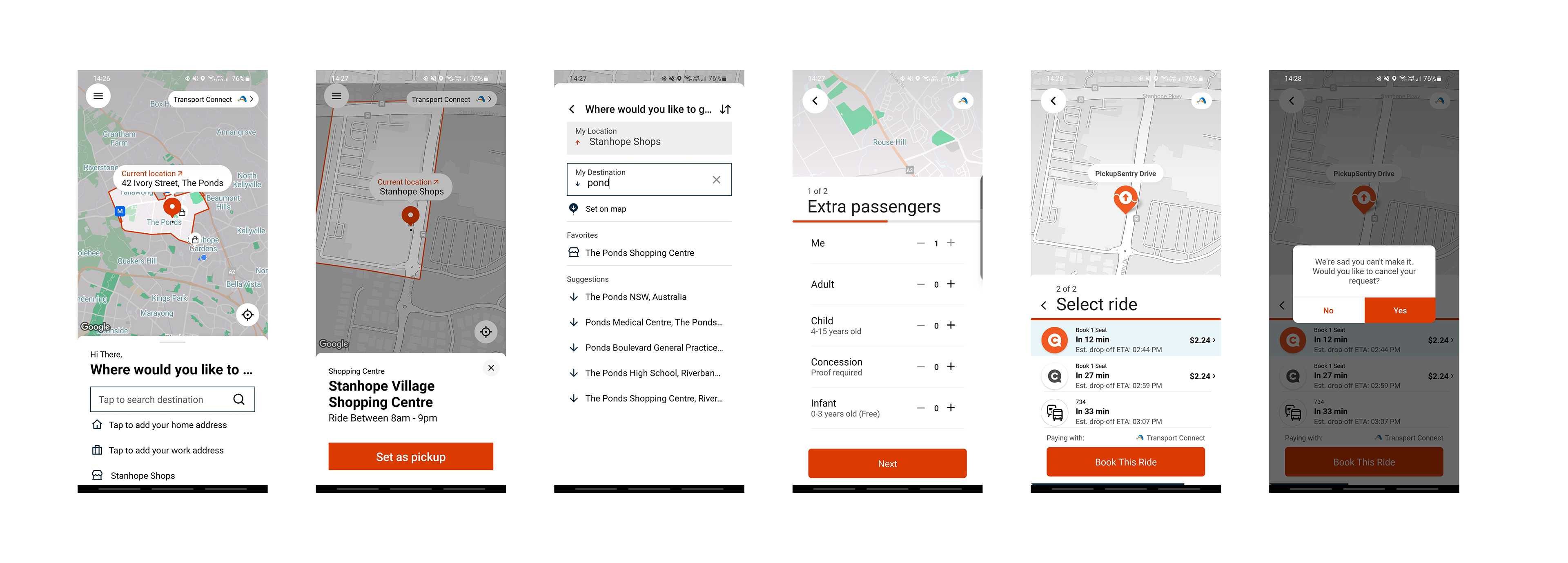
Passenger booking flow
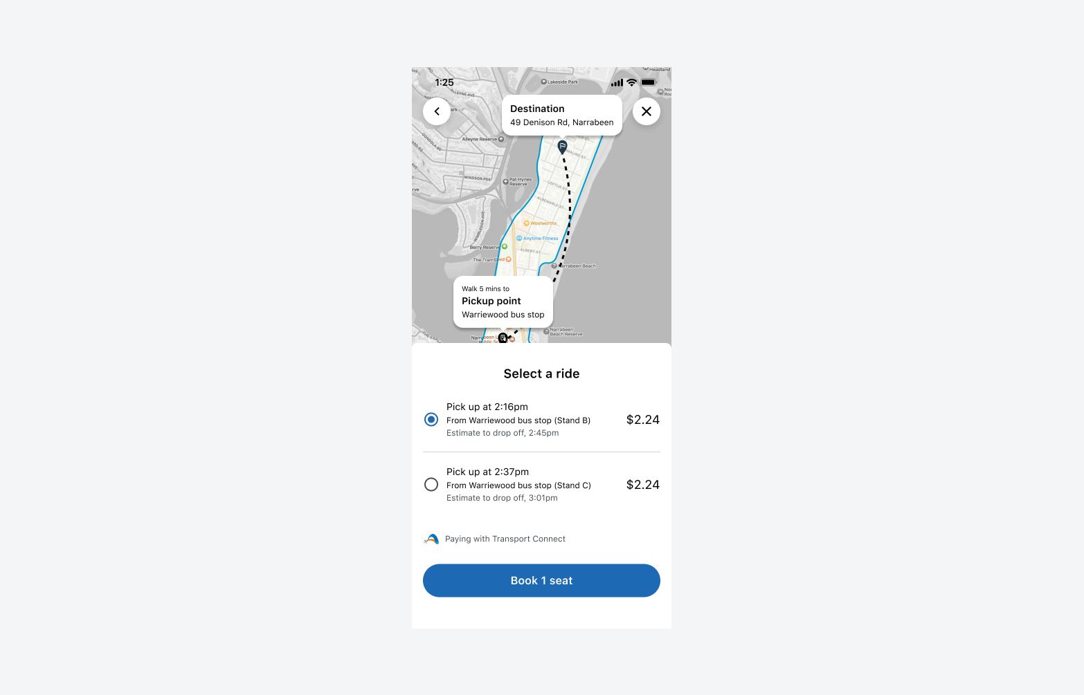
We meticulously streamlined the booking process by adhering to UX best practices, guaranteeing that passengers could effortlessly navigate through the app. They can now seamlessly select their desired pickup and drop-off points, peruse the available rides, initiate bookings, and effortlessly track the vehicle's progress.
By doing so, we addressed the essential need for a user-centric and intuitive booking experience. This approach not only enhances passenger satisfaction but also empowers operators with efficient route planning capabilities. In essence, our design not only prioritises user convenience but also optimises operational efficiency, a hallmark of sound UX design.
Link to wireframes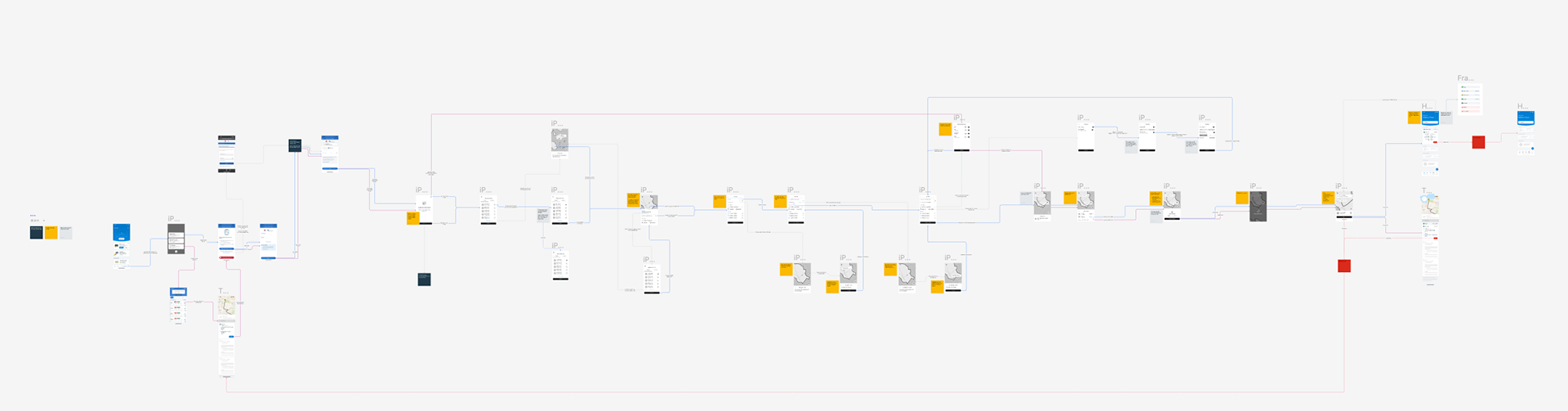
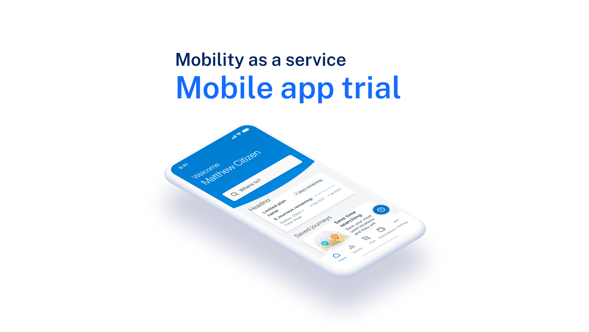
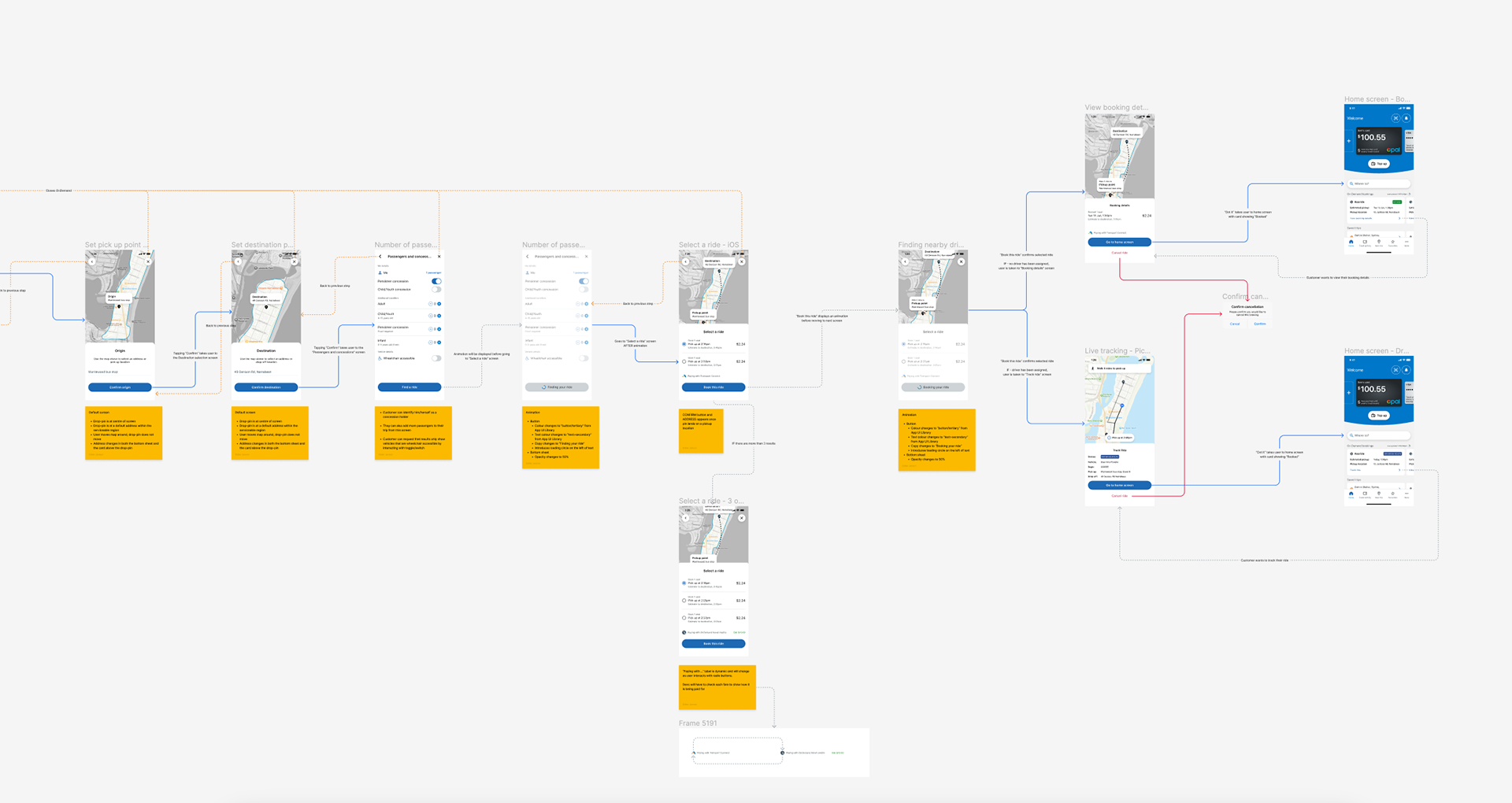
High-Fidelity UI
The high-fidelity UI design was crafted with consistency to the brand identity of the existing Opal Travel App (OTA), ensuring that users experienced a seamless transition within the services offered in the app. This alignment with OTA's design system not only established a sense of familiarity but also reinforced user trust.
In addition to brand continuity, we also placed a strong emphasis on user-friendliness and dependability, taking into account iOS and Android native design patterns. By integrating these platform-specific design elements, we guaranteed that users across both ecosystems would feel right at home when navigating our OnDemand service. This strategic design approach prioritised not only the aesthetics but also the functionality and overall experience, ensuring that the application truly resonated with users on their preferred mobile platform.
Key design elements included:1. A clean and intuitive user interface with a consistent colour palette
2. Clear and legible typography for seamless information consumption
3. Clear and friendly instructional copy to guide the user
4. Intuitive icons and symbols for easy navigation
User testing
Due to time/project constraints, user-testing was initially seen as a ‘nice-to-have’, but it soon became apparent that OnDemands implementation into the existing Opal Travel App (OTA) eco-system introduces complexities and usability patterns that other third-party OnDemand operator apps don't have to address.
This time/project constraints forced us to take a lean approach to user-testing, so we decided that guerilla testing would be conducted with current staff members who are not part of the OnDemand project.
we tested the prototype with 5 participants and below are the notes taken during these sessions
Prototype
Interactive prototypes were crafted to simulate user interactions and gather feedback. Users could experience the ease of booking and vehicle tracking. Continuous iterations ensured that the UI design met user expectations.
What are we testing?
The scenarios that were tested are as below,
1. One passenger, who is a concession holder and travelling with a child
2. One passenger, requiring an accessible vehicle
3. One passenger travelling alone
What did we want to find out?
It was important to identify early on what exactly we wanted to prove/disprove from our user testing sessions. Identifying these would allow us to define and craft multiple scenarios and have users perform certain tasks to help us validate/invalidate our hypotheses.
We wanted to know if users,
1. understand the flow and are able to plan and book on demand trip intuitively
2. understand how the trip is being paid
3. can apply different concessions to passengers
4. understand the difference between ME and ADDITIONAL passengers
5. understand how to request an accessible vehicle
6. understand that they'll have to walk a short distance and why
7. know how to track/cancel a ride
We also wanted to observe,
1. their interaction with the map to see if,
2. the interact with the map or,
3. try to tap address in bottom sheet expecting to be able to type
4. screens where they struggle to understand what they are seeing
Outcomes and findings
Finding ‘OnDemand’ from home screen:
1. 4 out of 5 users uses found ‘OmDemand’ from ‘New Trip’ easily
2. 1 out of 5 users tried to tap ‘Where to' first, but then found ‘OnDemand from 'New Trip’ easily
Solution:
No change

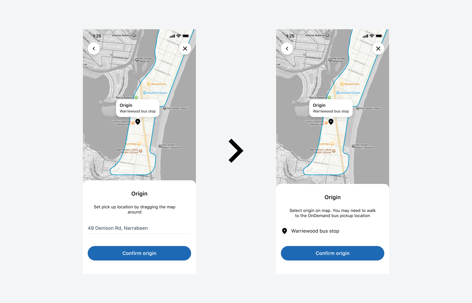
Map:
1. 3 out of 5 users used the map correctly
2. 2 out of 5 users thought that input field in bottom sheet was actionable
Solution:
1. Updated copy in bottom sheet to: “Move the map to select your origin. You may need to walk to the pickup location”
2. Changed UI in bottom sheet so that address no longer looked like an input field
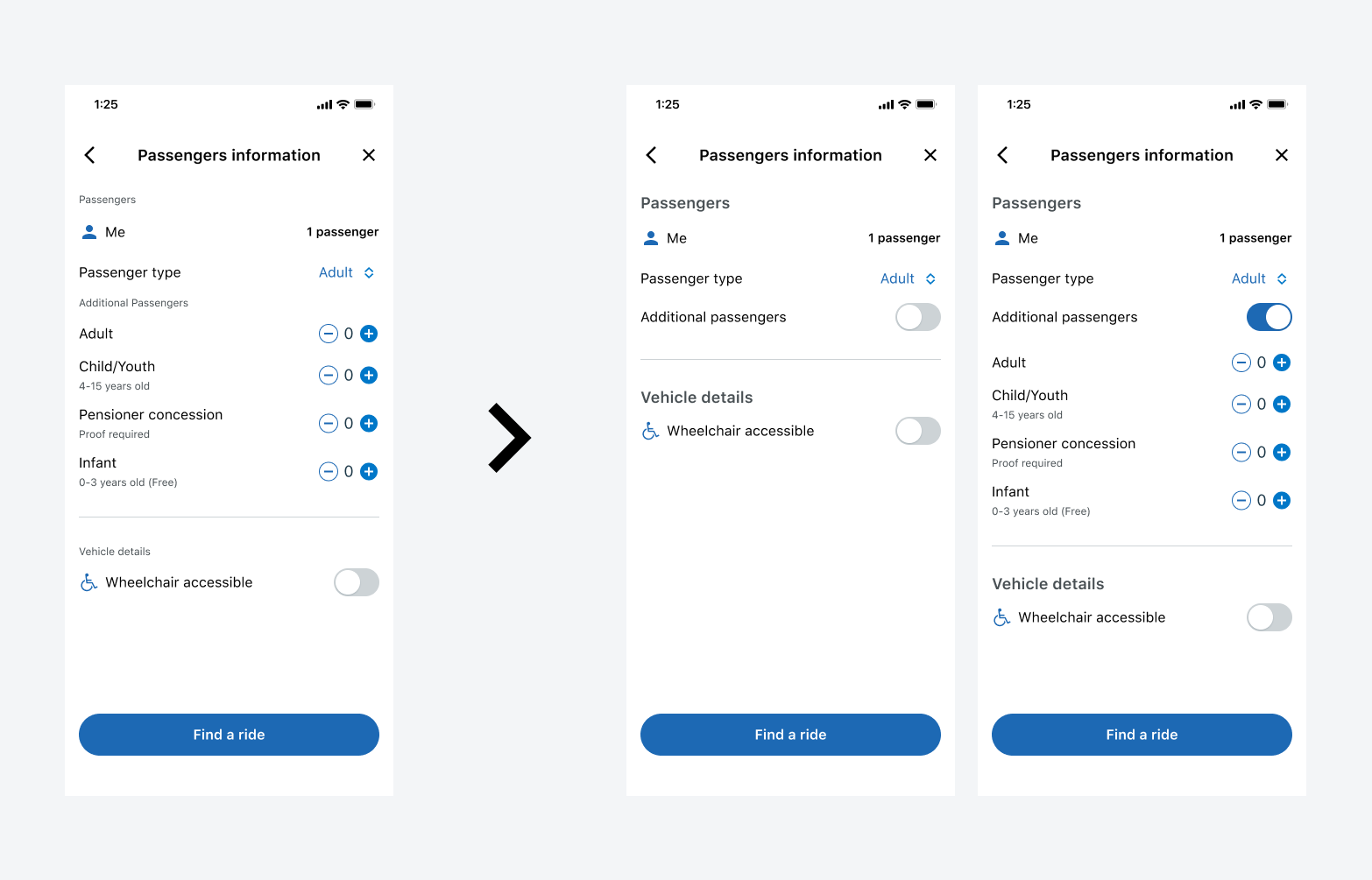
‘ME’ vs ‘Additional passengers’:
1. 3 out of 5 users understood ‘ME’ vs ‘Additional passengers’
2. 2 out of 5 users thought they needed to add themselves in the ‘Additional passengers’ section
3. We deduced that the “Additional passengers” had too much affordance and drew the users focus away from “ME' section
Solution:
We hid “Additional passengers” behind a toggle that required users to turn ON if they needed additional passengers
Ride options:
All users understood how to select a ride
Observation only:
2 out of 5 users assume that.
a. the bottom sheet was scrollable for more ride options
b. the bottom sheet would expland to show more ride
Tracking and cancelling a ride:
1. All users understood how to ‘track’ ride from home screen
2. All users understood how to ‘cancel’ ride from homescreen
Observation only:
1 user suggesting we make the cancel confirmation message clear about IF the user was being charged for cancelling

Conclusion
The wireframe and high-fidelity UI development phase for this project successfully translated the insights gathered during initial discovery and competitor analysis into a user-friendly and intuitive offering. By prioritising simplicity and convenience we addressed the unique challenges and opportunities presented by this innovative transportation service.
In this MVP phase, we have focused on the essential components of passenger booking and vehicle tracking. Future iterations of this offering could include the addition of features such as
1. Operator Dashboard
2. Notifications and,
3. Account Management
This approach will allow us to refine and enhance the service based on user feedback and evolving needs.
The project now stands ready for development, with a solid foundation that promises a reliable, efficient, and user-centric experience for passengers.